Indian Olympic Association
Our passion for sports branding and marketing has been a recurring theme throughout our careers, working with apparel and fitness brands, and sports foundations, pretty much on a daily basis. Winning the tender to rebrand the Indian Olympic Association gave us a chance to create an identity for Indian sport that could stand the test of time.
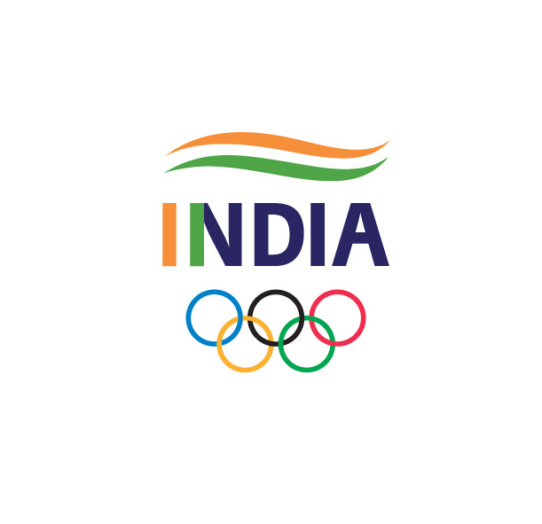
When we set out to design the logo, it was with the intention to create an identity that truly represented India. The previous identity was designed around the Star of India emblem which was in use during the British Raj, and is seldom recognized by Indians or global audiences.
The stripes of the tricolour were sports-agnostic and region-agnostic , as the colours of the flag are what’s recognizable to every person of Indian origin , and the global audience. The stripes of the tricolour could also be played with to form a podium, race track and field, as a nod to the history of the Olympic Games in ancient Greece, when track and field made up the original athletics program.
We also wanted to ensure that the logo for the IOA and for Team India, represented the country, its athletes, and its youth, with a sporty design that could age well over another 100 years.
The tricolour was built directly into the typeface, while the negative space between the I and N, represented “1” for Ek India, Team India an anthem that could be used to launch the new identity, and be carried forward as a tagline.